Lock Stock and Fresh
Here is a quite an interesting branding assignment that came to me recently. It was for the start up company- Lock stock n Fresh. They basically provide a platform where one can buy homemade edible goods across India. Their request was to make the branding as neat and minimalistic as possible and to use a single or a double color only so as to make screen printing possible.
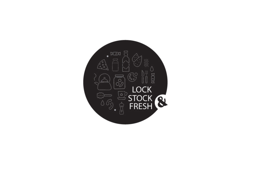
Upon further exploration, the design elements within the logo were formulated.. This was created as visual elements for use in packaging, posters etc, mainly for the purpose of branding. The basic idea is that the elements within the circular space can be changed as need be, keeping the letter ‘&’ constant- and THAT forms the brand’s identity.

CONCEPT EXPLORATION

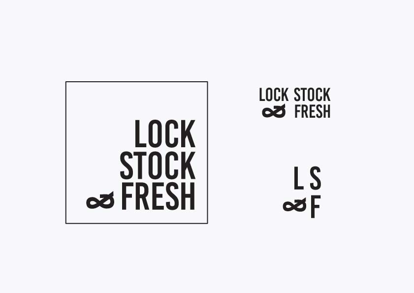


TYPOGRAPHY EXPLORATION

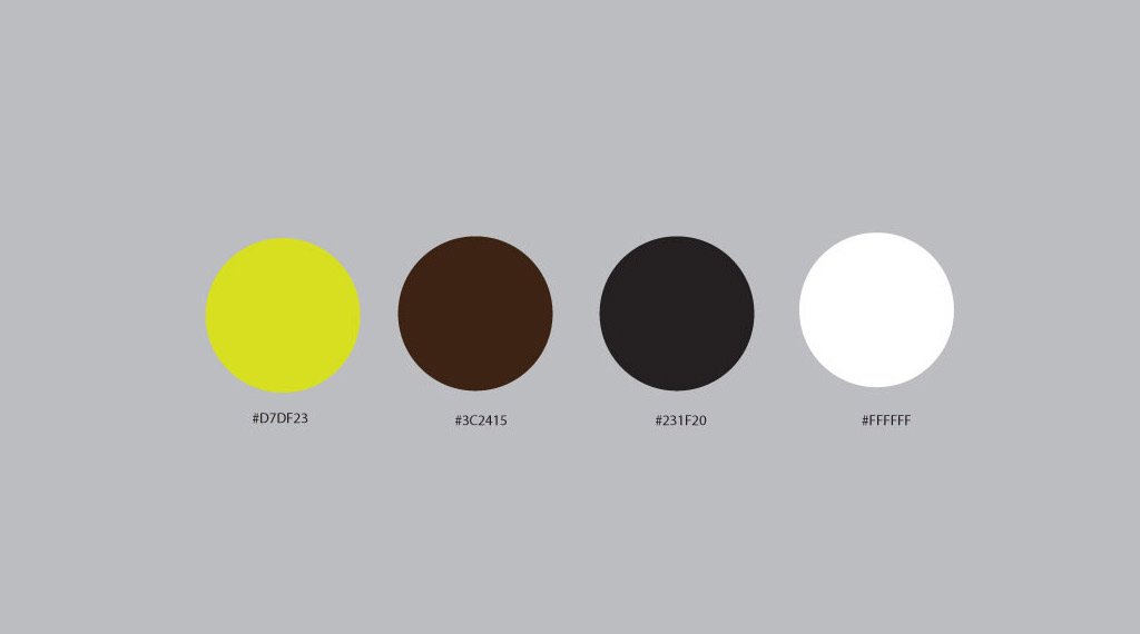
COLOR EXPLORATION


FINAL LOGO