‘Sentido’ is a speciality coffee shop which would like to change how India drinks coffee. Their first step in this journey was to start a coffee shop based out of Hyderabad, India. When we started out, they gave me a branding brief explained as below
“We want our brand to stand out for high quality consistent coffee on any day at any given time. When our customers walk into our coffee shop we want them to have an experience which ignites all the five senses. The aroma of the coffee should be the first thing that they notice as soon as they walk through the door. Visually the store should feel inclusive and make the whole ordering experience intuitive and non-intimidating.”
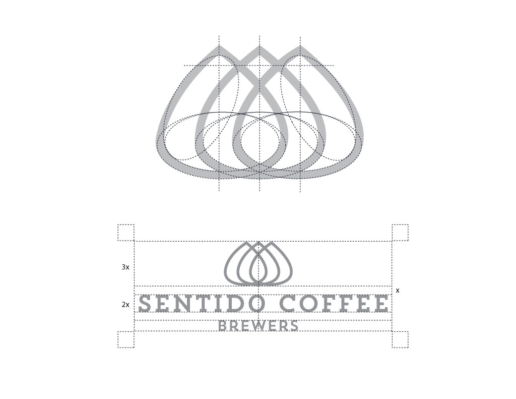
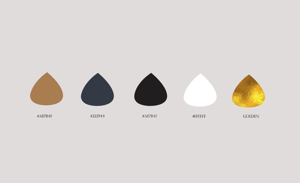
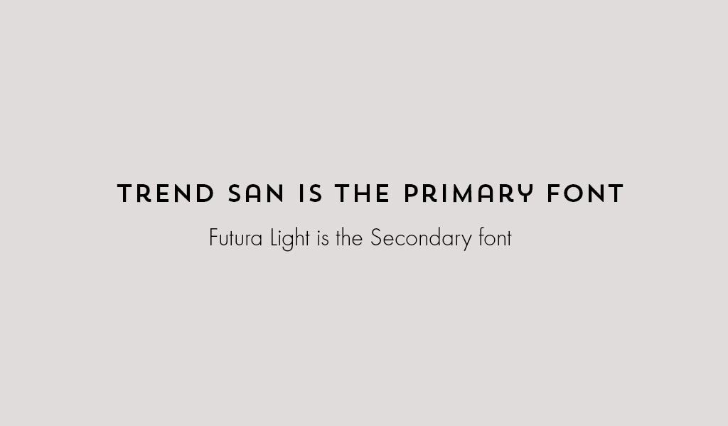
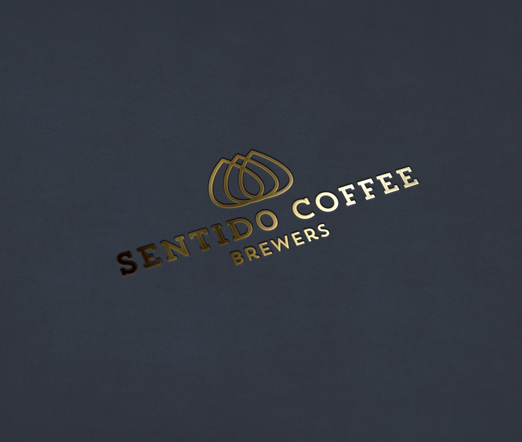
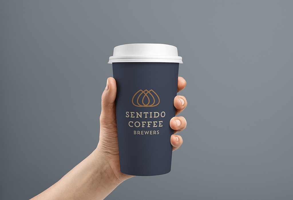
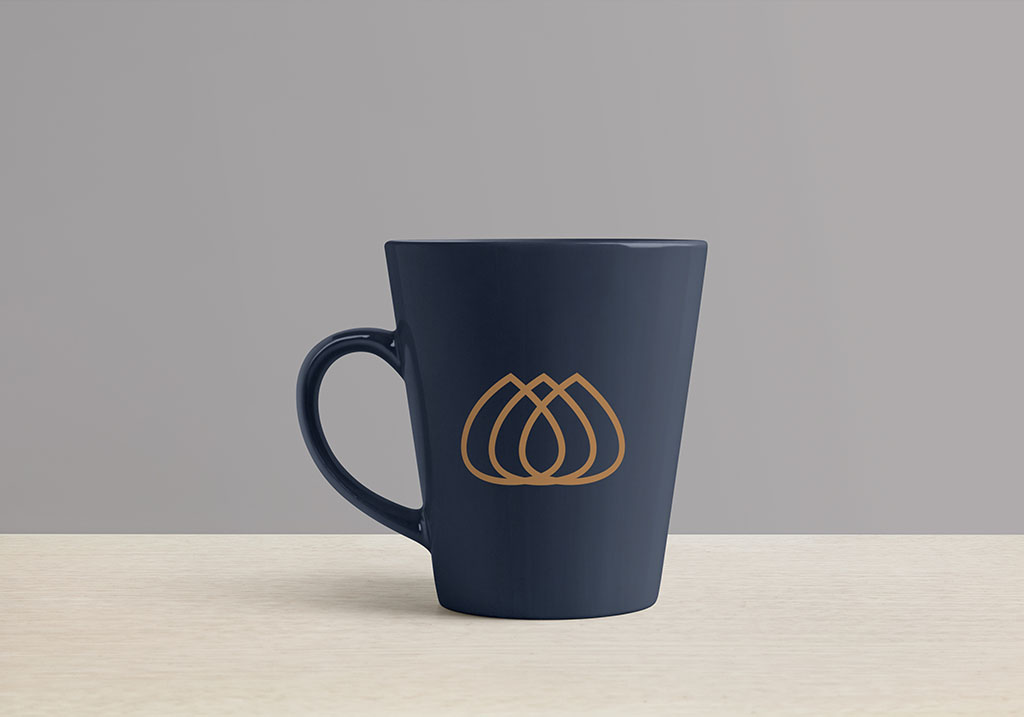
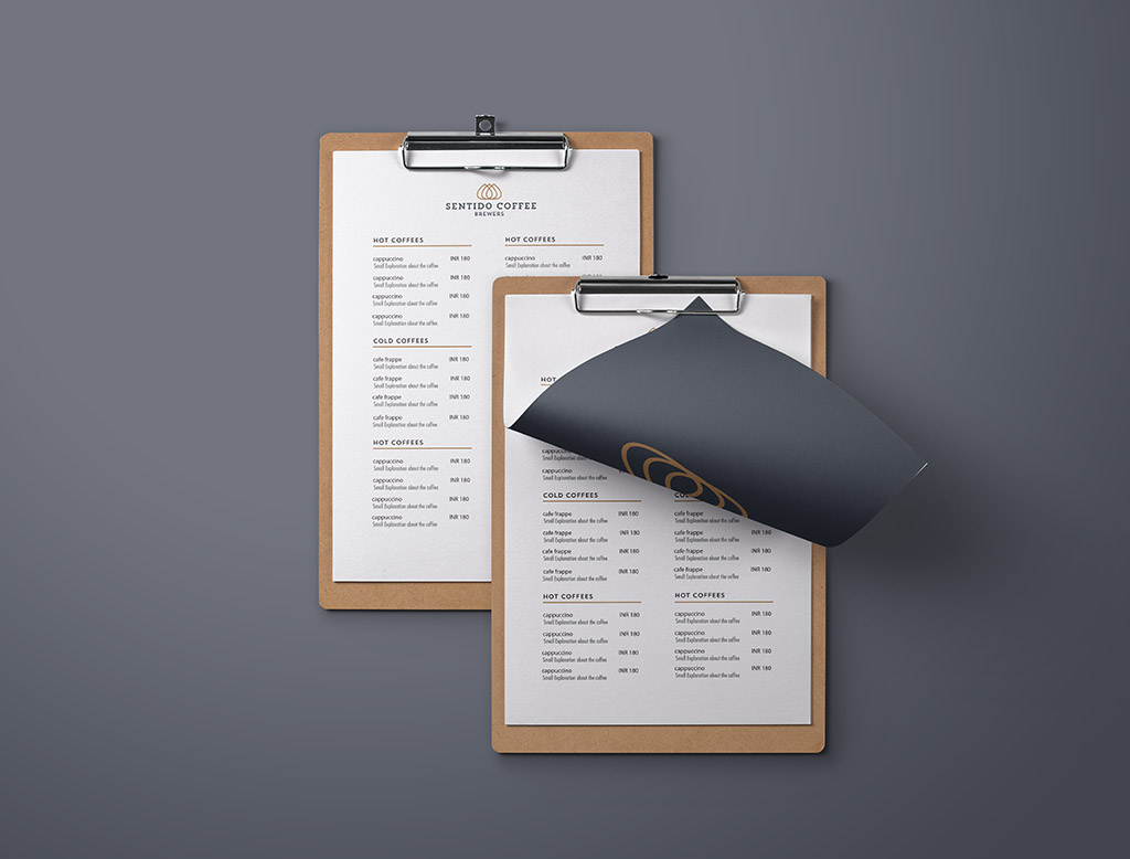
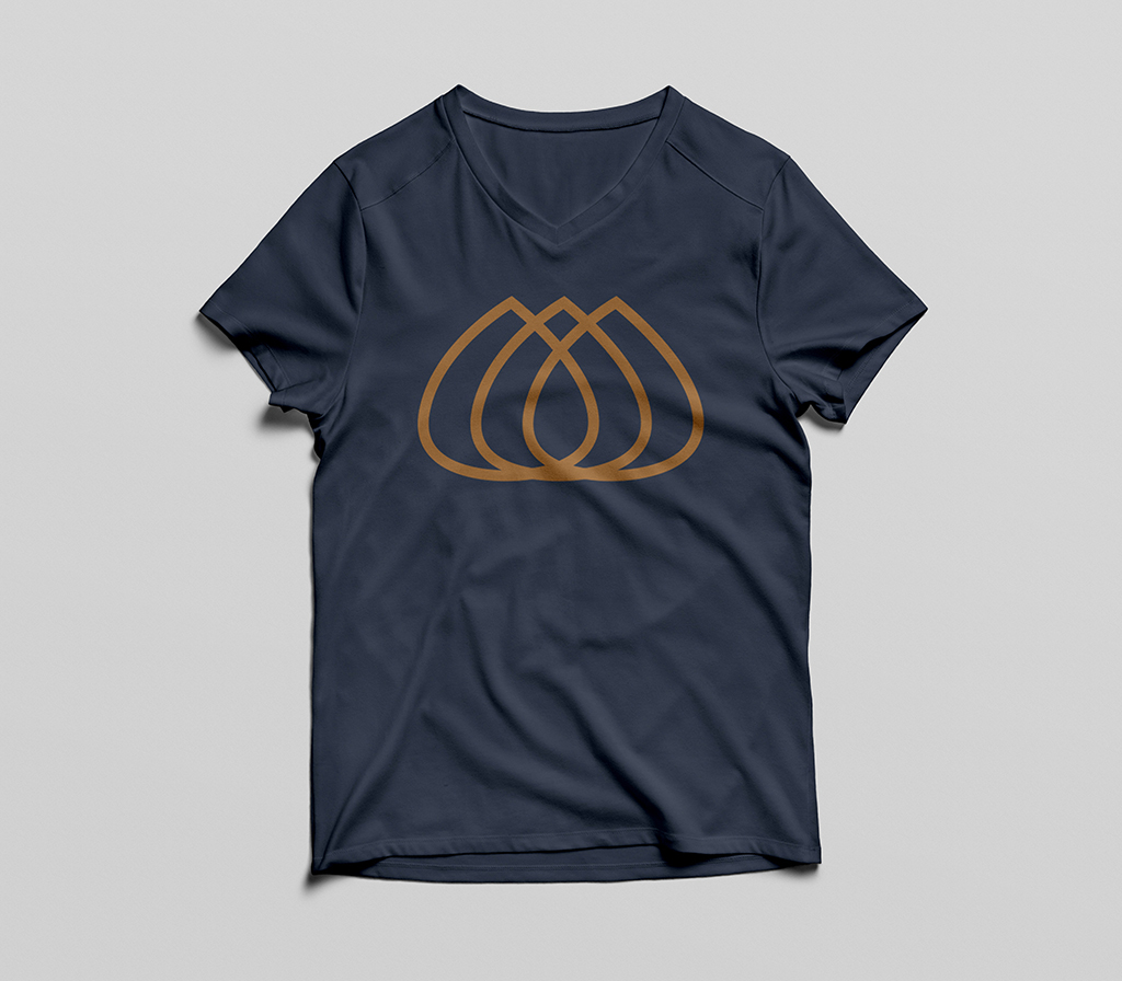
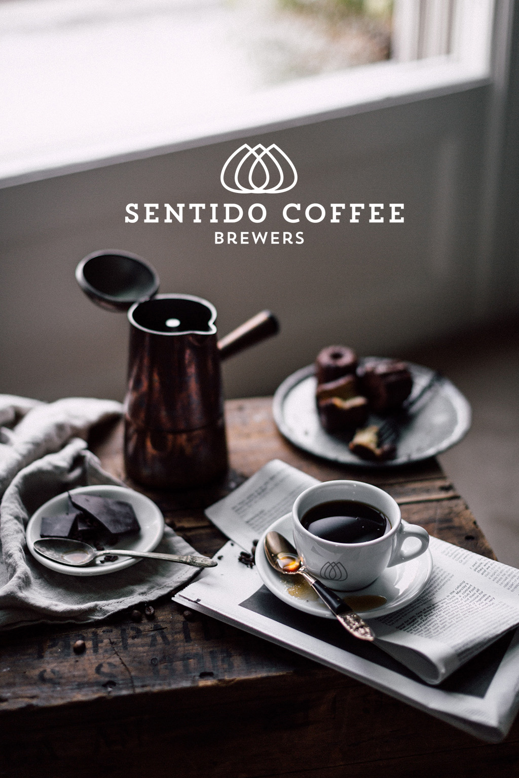
The task here was to capture the curious enthusiasts who are willing (and able) to invest more in their coffee ritual for a higher quality product and more holistic experience.Our idea was to create an intelligent and intriguing brand that would intuitively convey the team’s knowledge and care for the product, as well as their passion for the people who produce and enjoy it. We decided to design an abstract logo and avoid the usual coffee associated symbols like coffee cups, coffee beans..etc. Combining three coffee drops , we developed a logo which has five enclosed regions representing five senses. The entire branding has been kept minimal in color and typography .Addition of a golden tinge in the color palette has made it look premium and at the same time the other colours helps to balance out the flexibility of the logo appealing to a broader customer base.



Comments (1)